
Data storytelling is the practice of combining data, visuals and narrative so that an audience understands a finding and acts on it. It is the step between having an analysis and having an outcome, and it is the step most often skipped.
A chart on its own is not a story. It shows what happened without saying why it matters, what caused it, or what should follow. The story is what surrounds the chart: the context that makes the number meaningful, the tension that makes it worth attention, and the resolution that tells the audience what to do. Every data story exists to support one decision, and naming that decision before building anything is the discipline that separates a story from a slide deck.
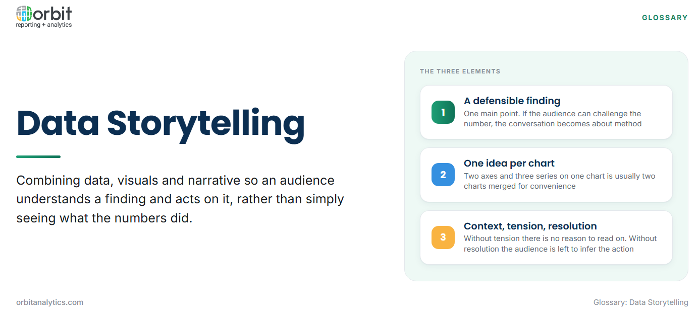
The three elements of data storytelling
The data: a defensible finding. The analysis has to hold up. If the audience can challenge the number, the conversation becomes about methodology and the finding is lost. The finding also has to be singular: a story carries one main point, and additional points belong in an appendix.
The visual: one idea per chart. Each chart makes a single argument. Two axes, three series and a secondary scale on one chart is usually two charts that have been merged for convenience, and the audience will read neither.
The narrative: context, tension and resolution. Context establishes what normal looks like. Tension identifies the gap between what was expected and what happened. Resolution explains the cause and states what should be done. Without tension there is no reason to keep reading; without resolution the audience is left to work out the implication themselves, which is the presenter’s job.
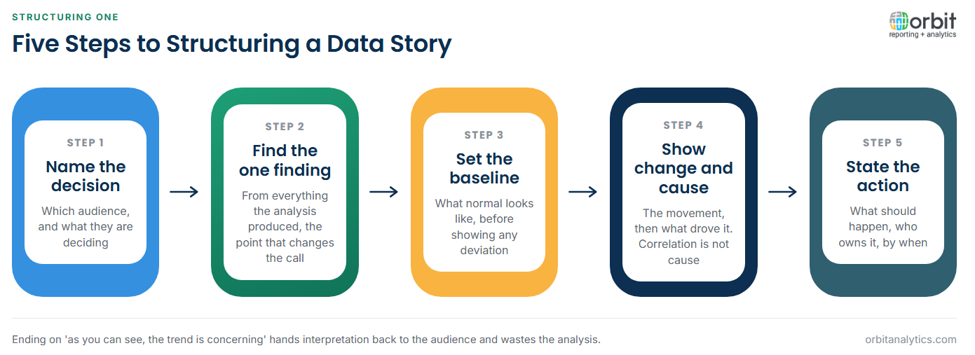
How to structure a data story
- Name the audience and the decision. A board reviewing capital allocation and a plant manager reviewing downtime need different stories from the same dataset.
- Find the one finding that matters. From everything the analysis produced, identify the single point that changes the decision.
- Set the context and the baseline. State what normal is before showing the deviation. A figure without a baseline cannot be judged.
- Show the change and the cause. Present the movement, then explain what drove it. Correlation offered as cause is where credibility is lost.
- End on the recommended action. Name what should happen, who owns it and by when.
Choosing the right visual for the point
Chart choice follows the argument being made, not personal preference.
| The point being made | Appropriate visual |
| Change over time | Line chart, or column for few periods |
| Composition and share | Stacked bar, or treemap for many parts |
| Comparison across categories | Horizontal bar, sorted by value |
| Correlation between measures | Scatter plot |
| Distribution of values | Histogram or box plot |
| A single headline figure | A large number with its comparison |
The last row matters more than it appears. When the point is one number, a chart adds nothing: the number itself, stated large with its prior period beside it, communicates faster than any visualization. A short table also beats a chart when the audience needs to read exact values rather than see a shape.
Data storytelling for financial and operational audiences
A CFO decides in the first thirty seconds whether a report is worth continuing with. That time is spent looking for the headline number, its movement against plan, and whether anything requires action. A story that opens with methodology has already spent its budget. Leading with the conclusion and supporting it afterwards is the structure that works, and it is the opposite of how analysis is usually conducted.
Variance stories land when they attribute the gap. Reporting that costs rose eight per cent invites a question; reporting that they rose eight per cent, of which six points came from one input price and two from volume, answers it. Operational stories need a different shape again: an owner and a threshold. A metric presented without who acts on it and at what level it becomes a problem is monitoring rather than storytelling, which is why a well-built CFO dashboard pairs each measure with a target. Orbit Analytics carries those targets alongside live Oracle ERP figures, so the variance and its threshold appear together rather than in separate documents.
Common data storytelling mistakes
- Presenting every chart you built. The analysis produced forty views; the story needs three. Showing the work is a habit from academic writing and it dilutes the finding.
- Burying the finding on slide nine. Building to a conclusion works in a lecture. In a business review, the audience has decided what they think before you arrive at it.
- Truncated axes and misleading scales. A y-axis starting at 94 makes a one per cent change look catastrophic. Even when unintentional, it costs credibility permanently once noticed.
- A story with no recommended action. Ending on “as you can see, the trend is concerning” hands the interpretation back to the audience and wastes the analysis.
Tools and techniques that support data storytelling
Three capabilities carry most of the load. Interactive dashboards support exploration, letting a reader test the finding themselves, which is what converts scepticism into agreement. Annotated reports support distribution, since most stories are read without their author present and the annotation is what survives that gap.
Automated commentary matters at scale. When the same variance story must be produced for forty cost centres, generating the narrative structure from the data and letting analysts edit the exceptions is the only workable approach. Orbit Analytics supports this through its business intelligence platform, where dashboards, distributed reports and commentary all read the same live Oracle ERP data, so the story a manager explores and the one a director receives cannot disagree.
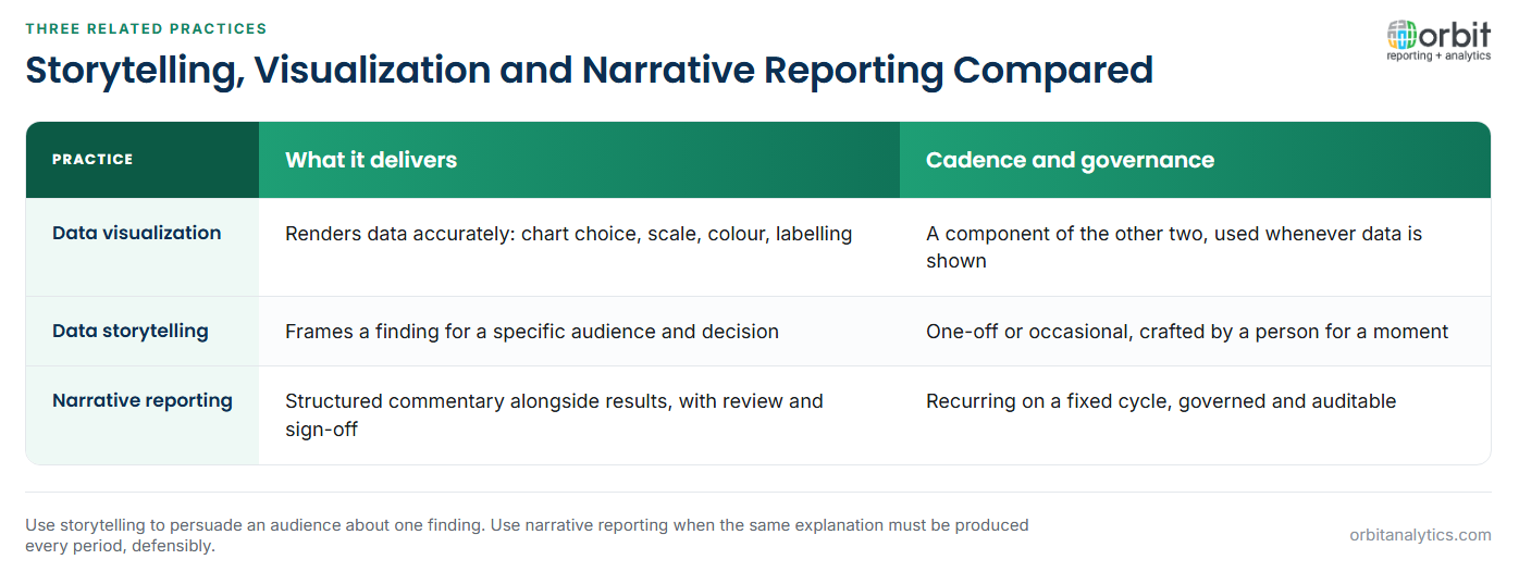
Data storytelling vs. data visualization vs. narrative reporting
These three overlap and are routinely used as synonyms, which obscures a genuinely useful distinction.
Visualization renders the data. It is the craft of turning numbers into a visual form that can be read accurately: chart selection, scale, colour and labelling. It is a component of storytelling, not a substitute for it.
Storytelling frames it for a decision. It adds audience, context, causation and recommendation around the visual. It is a communication act performed by a person for a specific purpose, and it is usually one-off or occasional.
Narrative reporting is the governed, recurring form. It is the discipline of producing structured commentary alongside financial and operational results on a fixed cycle, with review, sign-off and audit trail. Where a data story is crafted for one moment, narrative reporting is a repeatable process producing a standard artefact such as a management commentary or board pack.
The practical difference is governance and cadence. Use storytelling when persuading an audience about a specific finding. Use narrative reporting when the same explanation must be produced every period, consistently and defensibly.
Frequently Asked Questions
Q1. What is data storytelling?
It is combining data, visuals and narrative so an audience understands a finding and acts on it. The story supplies the context, cause and recommended action that a chart alone cannot.
Q2. What are the three elements of data storytelling?
A defensible finding in the data, a visual that makes one clear point, and a narrative built from context, tension and resolution. Removing any of the three weakens the other two.
Q3. What is the difference between data storytelling and data visualization?
Visualization is the craft of rendering data accurately in visual form. Storytelling wraps that visual in audience, context, causation and a recommended action so it drives a decision.
Q4. What is the difference between data storytelling and narrative reporting?
Storytelling is a communication act crafted for a specific audience and moment. Narrative reporting is a governed, recurring process producing standard commentary alongside results each period, with review and sign-off.
Q5. How do you structure a data story?
Name the audience and decision, identify the single finding that matters, set the context and baseline, show the change and explain its cause, then close on a recommended action with an owner.
Q6. Can data storytelling be automated?
The repeatable parts can: pulling the figures, generating variance commentary and assembling the structure. The judgement about which finding matters and what should be done remains human work.
Stories fall apart when the figures behind them are stale or cannot be traced. Orbit Analytics builds dashboards, distributed reports and commentary on the same live Oracle ERP data, so every number in the story holds up under questioning. Request a demo to see it with your own reporting.
