
Most PeopleSoft dashboard examples published online show a screenshot and stop there, which tells you what one looks like and nothing about what it should carry. This page lists twelve dashboards organizations actually run in PeopleSoft, with the metrics on each and where each one stops being useful.
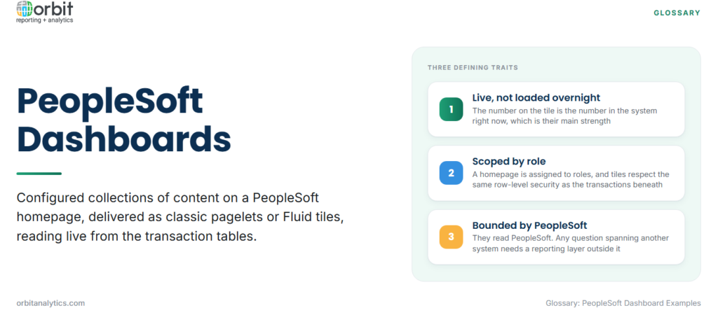
A PeopleSoft dashboard is a configured collection of content, delivered either as classic pagelets on a portal homepage or as Fluid tiles on a modern homepage. Both read live from the transaction tables, which is the defining characteristic: the number on the tile is the number in the system right now, not a figure loaded overnight.
Who sees which dashboard is controlled by role. A homepage is assigned to roles, and the tiles on it respect the same row-level security as the underlying transactions, so a department manager and a controller open the same dashboard and see different scopes.
That real-time, role-scoped design is why PeopleSoft dashboards are good at operational monitoring and weak at trend analysis, which is the trade-off running through every example below.
Quick reference: twelve dashboards by function
| # | Dashboard | Primary metrics |
| 1 | General ledger close status | Journals unposted, subsystems not transferred, days to close |
| 2 | Payables aging and payment run | Outstanding by bucket, due this week, discounts expiring |
| 3 | Receivables collections | DSO, overdue by customer, promises to pay |
| 4 | Budget versus actual | Variance by department, commitments, remaining budget |
| 5 | Headcount and turnover | Active headcount, starters, leavers, rolling turnover |
| 6 | Absence and leave liability | Days taken, accrued balance, accrued cost |
| 7 | Recruitment pipeline | Open requisitions, applicants by stage, time to fill |
| 8 | Payroll exception monitoring | Failed calculations, negative net pay, off-cycle payments |
| 9 | Requisition to purchase order | Requisitions awaiting approval, cycle time, aged items |
| 10 | Supplier performance | On-time delivery, quality rejections, price variance |
| 11 | Inventory position | Stock on hand, turns, items below reorder point |
| 12 | Student enrolment and grants | Enrolment by programme, retention, fund balance |
Finance dashboard examples
General ledger close status is the most valuable and least glamorous. It shows unposted journals, subsystems that have not transferred and days elapsed in the close, turning the close from a series of chased emails into a visible queue.
Payables aging and payment run groups outstanding invoices by age and flags what is due in the current cycle. Its highest-value tile is expiring early-settlement discounts, which are lost silently without one.
Receivables collections carries days sales outstanding, overdue balances by customer and outstanding promises to pay. Sorted by value rather than by age, it becomes a work queue rather than a status report.
Budget versus actual compares spend to budget by department and, done properly, includes commitments as well as actuals. A budget dashboard ignoring committed spend consistently understates the true position.
HR and workforce dashboard examples
Headcount and turnover covers active headcount, starters, leavers and rolling turnover. The detail that makes it useful is separating voluntary from involuntary exits, which most delivered versions do not.
Absence and leave liability tracks days taken and accrued balances, and translates the balance into cost. Accrued leave is a real liability and the dashboard is where finance usually first sees it.
Recruitment pipeline shows open requisitions, applicants by stage and time to fill. Stage conversion rates matter more than raw counts, because they show where candidates are lost.
Payroll exception monitoring flags failed calculations, negative net pay and off-cycle payments before a run is finalised. This is the dashboard with the shortest useful window and the highest cost of being ignored.
Supply chain and procurement dashboard examples
Requisition to purchase order shows requisitions awaiting approval and cycle time by stage. Ageing items sitting with one approver are the common finding.
Supplier performance tracks on-time delivery, quality rejections and price variance against agreed terms. It is only as good as receipt data discipline, so poor receiving practice shows up here as an apparent supplier problem.
Inventory position covers stock on hand, turnover and items below reorder point. Reading turns alongside stock value is what distinguishes healthy inventory from capital sitting on a shelf.
Campus and public sector dashboard examples
Student enrolment and retention applies to PeopleSoft Campus Solutions, covering enrolment by programme, term-on-term retention and at-risk indicators drawn from attendance and results.
Grants and fund balance tracks award balances, spend against restricted funds and expiry dates. The critical tile is spend that would breach a fund restriction, because that is an audit finding rather than a variance.
How PeopleSoft delivers dashboards
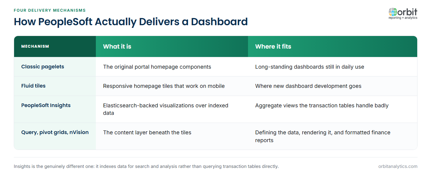
Classic pagelets sit on the portal homepage and are the oldest mechanism, still widely in use. Fluid homepages and tiles are the modern equivalent, responsive and usable on a phone, and are where new development goes.
PeopleSoft Insights adds Elasticsearch-backed visualizations, which is a genuinely different capability: it indexes data for search and analysis rather than querying transaction tables directly, so it handles aggregate views the other mechanisms handle badly.
Query, pivot grids and nVision supply the content beneath. PeopleSoft Query defines the data, pivot grids render it interactively and as tiles, and nVision produces the formatted financial reports that finance dashboards often link to.
What PeopleSoft dashboards do not do well
- Combining PeopleSoft with other systems. Dashboards read PeopleSoft. An organization also running Oracle EBS or Fusion Cloud cannot see one picture across them.
- Historical trend beyond the retention window. Reading live tables means history is limited to what has not been archived.
- Self-service beyond a prebuilt tile. A user wanting a cut nobody anticipated needs a developer, not a filter.
- Reporting load on the transaction database. Every dashboard refresh is a query against the system processing transactions, and heavy dashboard use during peak periods is felt. Orbit Analytics moves that load off the transactional system by reporting from its own layer.
Extending PeopleSoft dashboards with external reporting
The four limits above share a cause: dashboards are a window onto one transactional system. A reporting layer alongside PeopleSoft addresses them without replacing anything.
Reading PeopleSoft alongside Oracle EBS and Fusion Cloud is the main gain, since most organizations running PeopleSoft run at least one other Oracle application, and group questions cross all of them. Orbit Analytics reads all three, with its PeopleSoft analytics coverage keeping the drill path from a summarized figure back to the PeopleSoft record.
It also separates the audiences. Executives want a small set of trusted measures, managers want their own scope, analysts want to explore. A single set of tiles serves one of those three well, whereas the same governed data presented three ways serves all of them. Where genuinely live operational monitoring is the requirement, a real-time analytics dashboard is still the right instrument, and moving the reporting load off the transaction database is what makes running both viable.
Frequently Asked Questions
Q1. What is a PeopleSoft dashboard?
A configured collection of content on a homepage, delivered as classic pagelets or Fluid tiles, reading live from PeopleSoft transaction tables and scoped by the viewer’s role.
Q2. What is the difference between a pagelet and a Fluid tile?
Pagelets are the older classic portal mechanism. Fluid tiles are the modern responsive equivalent that works on mobile devices, and new development targets Fluid.
Q3. What is PeopleSoft Insights?
An Elasticsearch-backed analytics capability that indexes PeopleSoft data for search and visualization, handling aggregate analysis that direct table queries handle poorly.
Q4. Can PeopleSoft dashboards combine data from other systems?
Not natively. They read PeopleSoft data, so combining with Oracle EBS, Fusion Cloud or other sources needs a reporting layer outside PeopleSoft.
Q5. Do PeopleSoft dashboards show real-time data?
Yes. Pagelets and tiles query live transaction tables, which is their main strength and the reason heavy dashboard use adds load to the transactional system.
Q6. What is nVision used for?
Producing formatted financial reports from PeopleSoft general ledger data, typically statements and management reports that finance dashboards link out to.
Dashboards inside PeopleSoft answer PeopleSoft questions well and stop at the system boundary. Orbit Analytics reports PeopleSoft alongside Oracle EBS and Fusion Cloud with drill-down to the source record. Request a demo to see it across your Oracle estate.
