
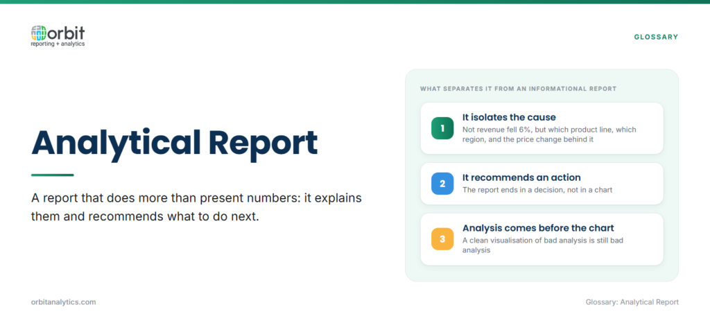
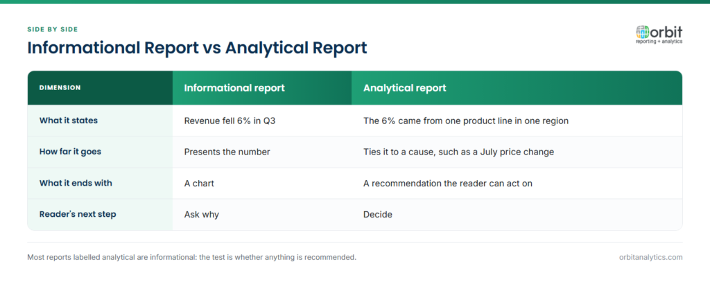
An analytical report does more than present numbers, it explains them and recommends what to do next. The difference matters. An informational report shows that revenue fell 6% in Q3. An analytical report shows that the 6% drop came from a single product line in a single region, ties it to a price change that took effect in July, and recommends a price-discrimination strategy for Q4.
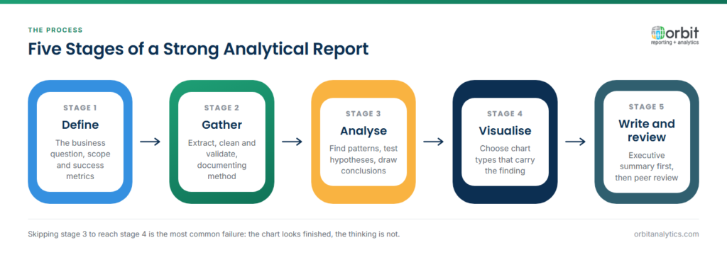
Most reports fail because the author skips the analysis and goes straight to the visualisation. A clean chart of bad analysis is still bad analysis. Strong analytical reports follow a repeatable process: define the question, gather data, analyse it, visualise the findings, write them up, and review before sending.
This guide walks through the six steps end to end, with prerequisites, tools, and the most common mistakes at each stage. It is written for finance, operations, and BI analysts producing reports for executive audiences inside Oracle ERP shops.
What you will need before starting
Prerequisites
Before you open a single tool, confirm four things: a clear business question or problem to solve, access to the relevant data sources, an understanding of who the report is for, and enough time to do the analysis properly. Skipping any one of these guarantees a weak final product.
Tools required
A good analytical report needs four categories of tool: a data extraction layer (a BI platform or reporting tool that pulls from your ERP and other systems), an analysis layer (Excel, Python, or a statistical tool), a visualisation layer (charts, dashboards), and a documentation layer (Word, slides, or a report template). Orbit Analytics provides the business intelligence platform that covers extraction, modelling, and visualisation in one place, with pre-built connectors to Oracle Fusion Cloud, EBS, NetSuite, and PeopleSoft.
Step 1: define your analysis objectives
What to do
- Identify the business question. State it in a single sentence. “Why did Q3 margin compress?” is a question. “Margin analysis” is not.
- Define scope and boundaries. Which periods, which products, which regions are in scope? What is explicitly out of scope?
- Determine success metrics. What will a good answer look like? Will the report inform a pricing decision, a hiring decision, or a budget reallocation?
- Align with stakeholder expectations. Confirm the question and scope with the person commissioning the work before you spend a day extracting data.
Common mistakes to avoid
Starting without a clear question almost guarantees scope creep. Assuming you know what stakeholders want is the second most common failure, a 30-minute conversation upfront saves three days of rework.
Step 2: gather and organise your data
What to do
- Identify data sources. List every system that contains relevant data, ERP, CRM, operational platforms, external benchmarks.
- Extract relevant datasets. Pull only what you need. A 50-million-row extract is harder to validate than a focused 200, 000-row extract.
- Clean and validate data. Check for nulls, duplicates, mis-coded fields, and outliers. Reconcile totals against the source system.
- Document your methodology. Note which tables you used, which filters you applied, and which transformations you ran.
Pro tip
Self-service business intelligence platform tools let analysts pull live data directly from Oracle ERP without filing tickets or waiting on IT queues. This shortens the question-to-extract cycle from days to minutes and makes the data-gathering step the fastest part of the workflow rather than the slowest. Orbit Analytics ships with over 1, 000 pre-built reports across finance, supply chain, and HR, many investigations start by adapting a pre-built report rather than building from scratch.
Step 3: analyse the data
What to do
- Apply appropriate analytical methods. Variance analysis, trend analysis, segmentation, correlation, pick the technique that fits the question.
- Look for patterns, trends, and anomalies. Aggregate first to see the big picture, then drill into the outliers.
- Test hypotheses. State a possible explanation and look for data that would disprove it. If you cannot disprove it, the hypothesis stands.
- Draw preliminary conclusions. Write them down before you visualise. The act of writing exposes weak reasoning.
Common mistakes to avoid
Confirmation bias is the silent killer of analytical work, looking only for data that supports the assumption you started with. Ignoring outliers without investigating them is the second trap. Outliers usually contain the most interesting findings, not noise to discard.
Step 4: create visualisations
What to do
- Choose the right chart type. Trends call for line charts; comparisons for bar charts; composition for stacked bars or treemaps; distribution for histograms or box plots.
- Keep visualisations simple and clear. One message per chart. If a chart needs a legend longer than three items, it is probably trying to do too much.
- Highlight key insights visually. Use colour to draw attention to the variance, the outlier, or the trend the reader must see.
- Ensure accessibility and readability. Test colour contrast, label axes clearly, and avoid 3D or decorative effects that obscure the data.
Pro tip
Match the visualisation to the data type, not to what looks impressive. A simple bar chart that answers the question beats a fancy chart that confuses the reader. Most senior audiences prefer a clear chart and a clear sentence over six charts and no conclusion.
Step 5: write your findings
What to do
- Start with an executive summary. One paragraph: what you investigated, what you found, what you recommend. Most executives read only this section.
- Present findings logically. Group related findings, lead with the most important, and use clear headings.
- Connect data to recommendations. Every recommendation should trace back to a specific finding and a specific data point.
- Use clear, jargon-free language. Write for the reader, not for other analysts.
Report structure template
A reliable structure for an analytical report:
- Executive summary
- Background and objectives
- Methodology
- Key findings
- Analysis and interpretation
- Recommendations
- Appendix (supporting data)
The appendix is where reviewers go to check your work. Putting detail there keeps the main report short and decision-focused.
Step 6: format and review
What to do
- Apply consistent formatting. Same fonts, same colours, same chart styling throughout. Inconsistency distracts and undermines credibility.
- Proofread for errors. Numbers, spelling, table totals, chart axes. A single wrong number erodes trust in the entire report.
- Get peer review. A second analyst should be able to follow your logic without your help. If they cannot, the report needs more work.
- Test with a sample audience. Walk through the executive summary with one stakeholder before formal release.
Final checklist
- Data accuracy verified against the source system
- Conclusions supported by evidence in the appendix
- Recommendations specific and actionable
- Format professional and consistent
Troubleshooting common issues
Problem: data quality issues
When source data is incomplete or inconsistent, document the limitations explicitly in the methodology section. Apply validation rules and reconcile totals before you start the analysis. A dedicated data management layer handles master-data alignment across Oracle ERP modules so analysts start from a clean base.
Problem: analysis takes too long
When the work expands beyond the time budget, the cause is almost always poorly defined scope. Reset by going back to Step 1 and confirming the question. Use pre-built reports and templates to shortcut the extraction step.
Problem: stakeholders do not act on findings
When recommendations sit unactioned, it usually means the report led with data rather than decisions. Restructure to lead with the recommendation, tie it to a specific business impact, and make the action concrete.
Problem: the report is too long
A 40-page analytical report rarely gets read. Use the executive summary to compress the message into one page, move detail to the appendix, and trim anything that does not support the recommendations.
Frequently Asked Questions
Q1. What is an analytical report?
An analytical report is a structured document that examines data to answer a specific business question, identify root causes, and recommend action. It goes beyond presenting facts (which is what an informational report does) to provide interpretation and recommendations.
Q2. How long should an analytical report be?
Length should match the complexity of the question. Most effective analytical reports run 5 to 15 pages, with an executive summary at the front and detailed appendices at the back. Anything longer usually means the main body needs editing.
Q3. What is the difference between analytical and informational reports?
An informational report presents facts and data without interpretation. An analytical report interprets the data, explains causes, and recommends action. The analytical version requires more skill and more time but delivers more value to decision-makers.
Q4. What tools are best for creating analytical reports?
The strongest workflows combine a BI platform for data extraction and visualisation, a spreadsheet or statistical tool for ad-hoc analysis, and a documentation tool for the final report. Self-service BI platforms reduce the data-gathering time and let analysts focus on interpretation.
Q5. What makes an analytical report effective?
Effective analytical reports are anchored in a clear business question, supported by validated data, structured around recommendations, and concise. The executive summary should convey the full message even if no one reads further.
Q6. How often should analytical reports be created?
Standard reports run on a fixed cadence, monthly close packs, quarterly business reviews, annual strategy documents. Ad-hoc analytical reports are produced as needed when a specific question or variance demands deeper investigation.
A great analytical report depends on clean data, fast extraction, and the freedom to investigate without waiting on IT. Request a demo to see how Orbit Analytics gives Oracle ERP teams the data foundation and self-service tools to produce sharper analytical reports in less time.
